
Modules Available for Project Websites
Header Module
Banner
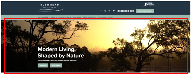
Background available: Image or video.
- Option to display full screen.
Image size:
- Desktop - 1200 x 500 px
- Mobile - 375 x 400px
Heading: Only option for size H1 however can amend size with coding.
Description text: Best to be between 15-20 words.
Text alignment options:
- Bottom - Left, Centre, Right
- Middle - - Left, Centre, Right
Buttons:
- Option to have maximum of 2 buttons.
- Primary or secondary colour options available.
Carousel Banner Container
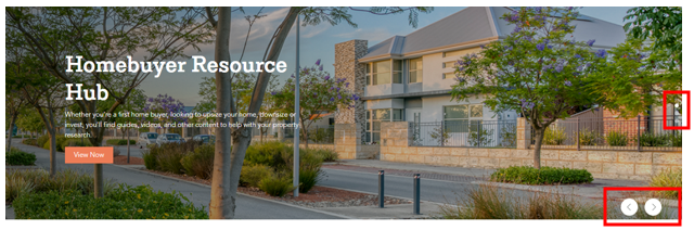
Same details as above.
Option to add multiple banner images which automatically adjust every few seconds.
There is also the option for the viewers to manually adjust the banners.
Body Module
Carousel Container
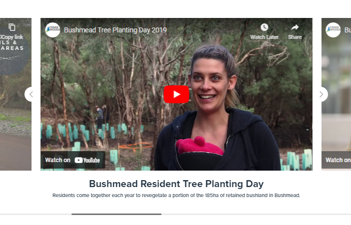
Layout:
Text Layout - Overlaid or below.
Text Alignment - Left or centre.
Media Type: Image or video.
Dimensions: 735 x 408 px
Text: Heading and Description text. Size can amend size with coding.
Text colour options: Primary, secondary, tertiary, black, white or body text.
Contact Details
Contact and Display Suite
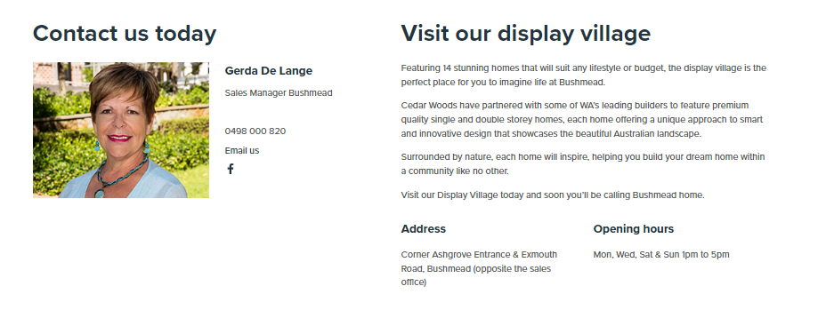
- Option to display only the contact details, display village details, both or neither.
Contact Details:
Image size: 257 x 198px
- Full name, email and position required.
- Other text options are mobile number, phone number, LinkedIn URL and Facebook URL.
Display Details:
- Heading, opening hours and address are required.
- Option to add a description also.
Body Module
General Content Block
Layout:
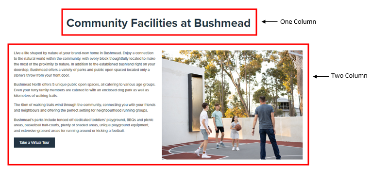
Block Type: One, two or three columns.
Column Width: Equal, one-third/two-third, two-thirds-one-third
Background Colour:
- Primary, primary tint (light), primary tint (dark).
- Secondary, secondary tint (light), secondary tint (dark).
- Tertiary, tertiary tint (light), tertiary tint (dark).
- White, black, light grey, grey.
Body Module
Horizontal Card Container

Layout:
Component Type: Feature (as above), narrow or full width.
Image Size: Half or two-thirds.
Text Colour: Primary, secondary, tertiary, black, white, body text.
Description Text Alignment: Left or centre.
Background Colour:
- Primary, primary tint (light), primary tint (dark).
- Secondary, secondary tint (light), secondary tint (dark).
- Tertiary, tertiary tint (light), tertiary tint (dark).
- White, black, light grey, grey.
Button Details:
Button Colour: Primary, secondary, black or white.
Card Background Colour: Same as above.
Card Text Colour: Primary, secondary, tertiary, black, white, body text.
Card Text Alignment: Left and centre.
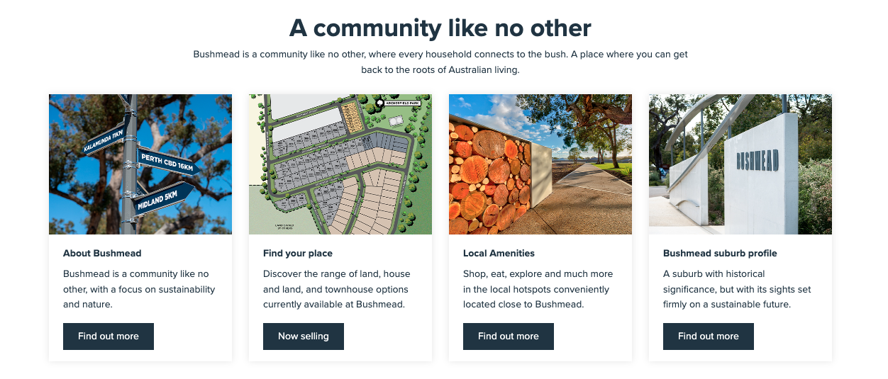
Vertical Card Container
 Layout:
Component Type: Simple or standard
Number of cards per row: 1, 2, 3 or 4
Text Colour: Primary, secondary, tertiary, black, white, body text.
Description Text Alignment: Left or centre.
Background Colour:
- Primary, primary tint (light), primary tint (dark).
- Secondary, secondary tint (light), secondary tint (dark).
- Tertiary, tertiary tint (light), tertiary tint (dark).
- White, black, light grey, grey.
Button Details:
Button Colour: Primary, secondary, black or white.
Card Background Colour: Same as above.
Card Text Colour: Primary, secondary, tertiary, black, white, body text.
Card Text Alignment: Left and centre.
Images
